
Take a second look: Derrenberger’s 2018 traditional art favorites
At the end of each year, we reflect on what that year has provided for us. We make lists of favorite movies, events, albums, video games, and even memes from the year.
Despite all that is created, much of the traditional art goes unnoticed, unless you regularly haunt museums. I love these ten pieces of art from 2018. They deserve to be recognized and celebrated.
I have many favorites, but these are the best.
10) “Train to Tokyo” by Surudenise
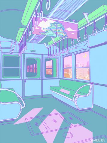
Surudenise tends to exclusively use pastel colors in her illustrations, creating soft, peaceful environments. The artist uses different locations in Japan, many of which are places as simple as a vending machine on the street corner or an alleyway between houses. Even if you have never been to Japan, the combination of the illustrations and the pastel colors give off such a cheerful, nostalgic vibe. “Train to Tokyo” is a perfect example of this. The mostly-geometric shapes of the train’s interior, colored with pastel creates tranquil sense. Typically, when pastels are used, they are used in bubbly, cotton-candy pieces. This, however, is a rather calm piece. All the lines are clean, too, making the whole work of art satisfying to view. The visual art, which uses pastel colors, Ancient Greek sculptures, glitch art, and 2000’s web design, attached to vaporwave music, is the only thing I can compare this feeling to.
9) “Takeover” by Kaneoya Sachiko
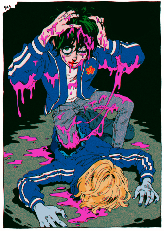
Although Sachiko uses the same art style in most of her pieces, each piece she creates is unique. Her art style shows influence of comics, manga, and even some anime. Much of her work has a dark demeanor and themes and “Takeover” is no exception.
The grim yet dull expression of the man emerging from the blue, dead body creates a gloomy, creepy atmosphere that’s intriguing. The neon pink liquid, which resembles blood, adds to the mysterious factor, and its contrasting manner draws the eyes to it.
Pieces that force the viewer the grasp for an explanation are enjoyable for me, and “Takeover” constantly has me trying to figure out the story behind it.
8) “Omneity” by Collin Elder
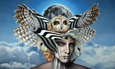
Every painting of Collin Elder connects humans to wildlife. Humans exist side by side with animals and have evolved similarly, but each is vastly different. The surreal pieces from Elder bring together animals, ones that can mostly be found in forests, and humans, to an equal state as if they are one.
His use of animals reminds me of Native American culture and how each animal acts as a totem or a spirit guide.
Like other Elder paintings, “Omneity” uses patterns, form, and movement. The patterns of the black and white lines coming from the wings of the owls (There are two!) creates an optical illusion with the man’s face.
“Omneity” is a very impressive piece and a pleasure to study.
7) “Banana Paint” by Paul Fuentes
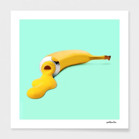
Although at first glance Fuentes’ pieces look minimalistic, it’s easy to see how magical they really are after a second look.
Paul Fuentes is a graphic pop art designer best known for uploading his work on Instagram. In his works, he combines ordinary objects, food, and animals.
I am particularly attached to “Banana Paint” because of the color scheme and its simplicity. Its out-of-the-box nature is compelling and aesthetically pleasing. Not all art pieces have to be extremely detailed to be great!
6) “You Won’t Get What You Want” (Album cover) by Jesse Draxler
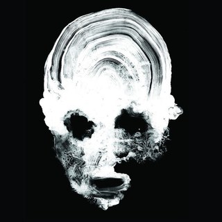
On October 26, the band Daughters released their first full album in eight years. The cover is Draxler’s typical greyscale work.
This work, similar to “Banana Paint” seems simple. Looking deeper, though, viewers can see that it is complex and unsettling.
In his review of the album, Sam Boyhtari says, “The Rhode Island noise outfit’s latest LP is an anxiety-inducing nightmare ode to human conflict, a rejection of harmony and altruism.”
The album cover reflects this feeling and manifests it visually. At the same, the work of art can be quite difficult to decipher.
The technical skill and raw emotion the piece exhibits is definitely something to be recognized.
5) “Hurricane” by Brett F. Harvey
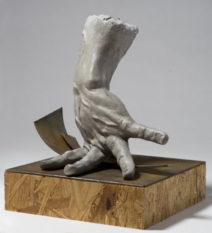
Almost everybody has seen old Greek sculptures like “Venus de Milo” and “Laocoön and His Sons,” and are usually thoroughly impressed by the sculptor’s technical skills. However, it seems many tend to forget that hyperrealistic sculptures are still being produced. Brett F. Harvey is dominating the game.
Harvey uses gypsum cement to convey the subjects of his sculptures as vulnerable, sensitive, and beautiful.
“Hurricane” is not a man. Instead, it is a twisted hand, making it more universal to all viewers. The details, like the defined creases and the bulging veins in the hand, can convey the tension or the natural disaster.
The hyperrealism and the grey material makes the whole piece raw and powerful. It is fascinating and impactful, despite being only a hand.
4) “Destroyer of Worlds” (Kraft brown version) by Jacob Bannon
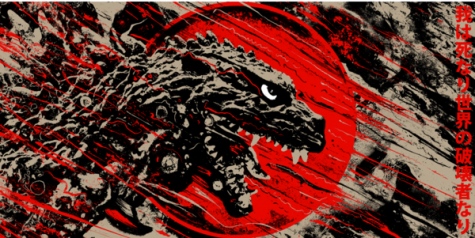
Although I tried not to include any type of fanart on my list, I couldn’t help myself because there are a lot of great pieces.
Though he is best known for being the lead vocalist of Converge, Jacob Bannon is a traditional artist, too and has done album artwork for Converge and other bands.
His original work is just as great. The kraft brown version, of his “Destroyer of Worlds” piece stuck out to me out of all his artwork from 2018. Kraft brown one of the colorways this print is available in. I personally like kraft brown the most.
The red sun of the Japanese flag frames Godzilla, creating a clear focal point on his menacing, murderous face. Red streaks of Japan’s flag turn into streaks of blood, creating movement in the direction of where the monster is growling, as if the blood was coming from people down below in the same direction.
This use of movement and the black shading on Godzilla creates interesting textures and makes this threatening piece give the same feel as its source material.
3) “Weighing the Options” by James Guppy
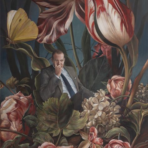
“Weighing the Options” and other pieces of the “Venal Garden” series by James Guppy are some of the most interesting concept pieces I have seen this year. Combining something as stern and serious as businessmen with large, magnificent flowers sounds obscure. Guppy uses his painting skills to make the idea work incredibly well.
“Venal” is another word for corrupt or greedy. In these paintings, Guppy makes this a pretty visual (despite the upsetting meaning behind it) with the use of great skill, less saturated colors, and complimentary flowers.
The use of desaturated colors reminds me of paintings from the 1940’s. These colors are great for setting the stern yet delicate tone. The expression of the business man contributes to this as well.
2) “Big Baby” by Raph Lomotan
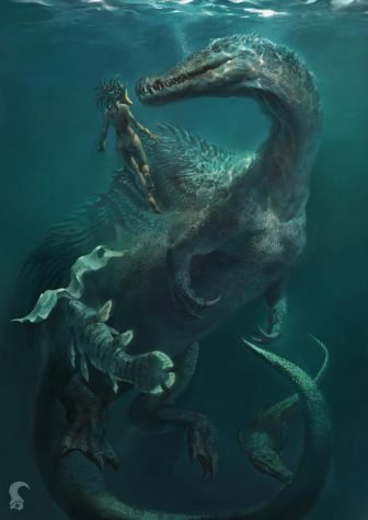
I must say, I have a huge soft spot for large, scary animals that are actually very sweet. Maybe that’s why I enjoyed Clifford as a kid.
Not only is “Big Baby” just what I adore, but it displays great skill in digital painting and sets an intimidating but peaceful tone.
The shadows and textures Lomotan creates to form this massive creature makes it feel life-like. With the man swimming next to the creature, the viewer gets an understanding of the scale of the enormous creature.
The ocean is terrifying and unknown to us as humans and a painting like this makes it all the more frightening, even though it is not real.
“Big Baby” is incredibly immersive–while looking at the art, the viewer may feel like he or she is underwater, too. The muffled, peaceful sounds of being underwater pass through the viewer’s ears and the feeling of freedom and gentle currents of floating around forces the viewer into the painting.
1) “The Chimera” by Heather Horton
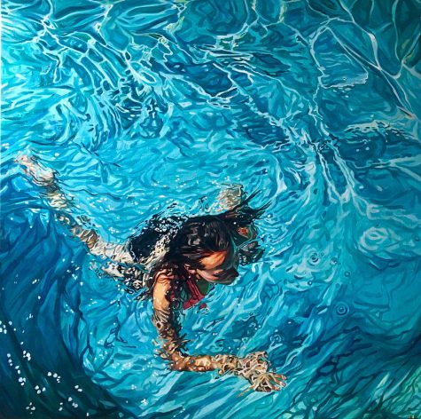
I don’t know what it is about water paintings that makes me enjoy them so much. Horton’s “The Chimera” is no exception.
The textures and colors of the water are impressive and the paint strokes of the woman submerged in water shows just how much detail was put into this piece.
The water ripples surrounding the woman as well as the contrast between the woman and the water create a clear focal point and movement.
Blue, rippling water of pools gives me a nostalgic feeling, which makes me like this piece even more.
“The Chimera” has been my absolute favorite piece of 2018 because of the detail, the colors, the movement, and clarity. Everything has been created with great skill and technicality. It almost looks like a photograph.
Your donation will support the student journalists of Linganore High School. Your contribution will allow us to purchase camera/recording equipment and software. We hope to raise enough money to re-start a monthly printed issue of our paper.